Sunday, June 29, 2014

i'm back in the creative groove!

ok, so i haven't be able to be as creative as i would like over the last couple/few years for multiple reasons, but this year seems to have hit me w/ a creative fury. i've got several new project going and doing artwork or creative work in several different areas. today, i realized that i should get back to posting things on my blog and getting some constructive criticism.

recently, a older man came up to me at our farmers' market and asked me to do some painting for him. he had purchased a very small coffee cup at starbucks for his mother's birthday, but he wanted some sunflowers painted on it. i haven't done any painting in a couple/few years and accepted the challenge. we discussed what he needed, and this is what i came up with --


i definitely like the side w/ the inscription the best, but i am not ashamed of the other side. i can easily acknowledge that it would've been better had i more time to spend on it, but i also know that i would've continued to fuss w/ it until i had "goofed it up"! you can get an good idea of what it looks like, even though it's hard to get a decent picture of something like this while fighting w/ the flash on the camera.

the white cup had a matte finish on it and an inscription cut into one side. he wanted something done on each side so it could be displayed/viewed from either side. i used acrylic paints on a sanded/prepped surface that was then sprayed with kamar varnish. it does NOT need to be washed or used -- it is for display purposes only.

Thursday, February 24, 2011

IF - layer - 2/18/2011

a page from my personal calendar, which i am trying to focus on drawing things in that have to do w/ life or w/ my interests. this is my entry for http://www.illustrationfriday.com/ for the 2/18 topic of "layer."

i really enjoy the challenge of illustration friday, where interested parties are typically sent a 1-word prompt and encouraged to illustrate it. the topic is completely open to interpretation. the completely different responses to these prompts just show how differently our minds work. i always try to throw out the first few ideas, figuring these will be something that everyone else will think of. i would like mine to be individual or at least not look like i was caught in a rut or mooching someone else's ideas! plus, i don't look at other postings until after mine is completed!

this week, i've been home w/ a lot of papers to grade, a couple days of flu bug, and a continual desire to work on my personal health and weight loss. these overwhelming ideas were bumping around in the creative stages w/ the prompt of "layers". plus, i LOVE to watch cooking shows, so i'm sure that's where the layer cake came from !

the idea here is that m-m-m-m, those lovely layer cakes could lead to extra layers on a woman's body, that would in turn lead to layered clothing to hide the layers of fat on the body. in my mind, they all seemed relatedl

this drawing was done w/ a green ink pen and takes up about 1/2 a day space in my personal calendar. maybe it will help me keep my mind on making better eating choices, avoiding those things that are not helping me, and the new little stamp can help me record my exercise routine.

Monday, February 21, 2011

red envelope exchange

i have joined in a couple of envelope exchanges for a yahoo group i am in, called calligraphy exchange. the idea is to hand letter your envelope and include a personal hand-written note -- both following the rules of the exchange.

this example of 2 that i did were for "red". the top example is a folded page from a magazine that was predominantly red, so i used silver sharpie for the lettering. the other envelope was folded from scrapbooking paper in a red/white design. i wanted the letters to look something like asian-style lettering, but it didn't quite work out the way i saw it in my head. first i lettered the stuff all out in dark red pen, which i was afraid would not be easily readable when it go to the post office. to make sure it was readable, i used a black pen to do some outlining of the letters. they are definitely more noticeable now, but i'm not sure i like them as much.

i've signed up for 2 more envelope exchanges coming up in this group, so i guess i'll start working on those ideas. i think i have it fairly nailed down on what i want to do, but will need some time to work on it to get it to where i want it to look.

feel free to make comments, suggestions, or throw ideas!!!

Wednesday, February 16, 2011

IF - sweater

this drawing was inspired by www.illustrationfriday.com on 2/11/11 with the word "sweater".

as soon as i heard the word, i knew that i was thinking of someone who was sweating instead of someone wearing a sweater. after all, once a woman reaches 40s, anything can be a hot, sweaty business!


i used this picture as a guide for the picture i drew. while it was based on a sumo wrestler, i'm not sure that my drawing doesn't look like an italian mafia dude.

regardless, i'm sure he's a sweaty person to be around and i definitely wouldn't want to be sharing space w/ him!

this was done w a brown fat prang colored pencil on 70# white sketchbook paper. A brief spray of fixative will keep the colored pencil from smearing more from wear and tear in the sketchbook.

Tuesday, February 01, 2011

IF - surrender

the topic posted on www.illustrationfriday.com on 1/28/11 was "surrender".

the first thing i thought of (after the stereotypical thoughts of white flags and gunpoint) was something to do w/ food, sneaking something that i/we couldn't or shouldn't have. so, my "surrender" was a bite out of a cupcake, like finally giving in a tasting it after looking at it sitting there.

this sketch is just done in ballpoint pen in my calendar. my calendar has become my motivation for doing something artwork each day. it's a motivation, addiction, determination right now. we'll see how long this lasts!

Sunday, January 30, 2011

planning out my life

this page was inspired by the purchase of my new calendar, in an attempt to get my life and my artwork more organized. i took the label from the front of the calendar, glued it to the journal page, and made my notes on there.

the pages were painted ahead of time, so i chose this page b/c of the purple color matching the label (and the calendar was purple!). i used a silver sharpie marker to list out my resolutions and then i drew silver snowflake shapes relating to the design on the calendar label.

this page was created the first week or january, 2011.

egyptian inspiration

another journal page made in advance -- pages painted w/ excess paint in various colors or patterns. i happen to like blue/green/purple together, so i ended up w/ a purple and green layout.

when i wanted to color one night, but didn't feel like the stress of actually doing a picture, i decided that something "egyptian" inspired would look good on this page. i used purple colored pencil on the green backgroun and then green colored pencil on the opposite purple page.

i started on the right side of the design and worked my way to the left w/ no idea or pattern in advance -- just doodling. i decided to leave the right side open and use it for future journaling. w/ that in mind, i lettered the word "reflection" up the left side of the page. i plan to do some journaling in purple ink on the green page. in response to what i might use to write on over the paint -- sharpie marker if the gel pen or ink pen doesn't work.

the background is painted w/ cheap acrylic paint, the drawing is done w/ prang colored pencils, and it's sprayed w/ kumar fixative to keep it from smearing over time in the book. this journal page was done (so far) in june, 2010.

to cut? or not to cut?

anyone who is a girl, who has girls, who hangs out w/ girls, or deals w/ girls in any way -- these people realize the importance of these decisions. my hubby, who raised 3 boys, was not aware of how important the issue of "bangs" might be in a girl's life! (not mine -- but other girls close to me!). the questions -- do i cut them? what if i don't like them? what if no one else likes them? what if they make me look ______ ? will they ever grow out to the same length again?

these thoughts recently came to mind to me as my daughter took assessment of who needed hair cuts for school to start. well, oldest one needed some cut. middle child didn't need any cut but she wanted it done. so, when not being closely monitored, she cut her own hair. youngest one didn't seem to care yet (she doesn't feel as much need to do all that the other two do).

mommy freaked about the self-imposed haircut that needed a trip to the salon to fix, but it all worked out! i guess mommy forgot that she cut her own hair when she was 2!

this page is done on a pre-painted composition notebook page. the color matched the idea and color i wanted to work w/. the artwork was done w/ a brown sharpie marker. there has been no protectice covering or spray protective put on this page.

Tuesday, January 25, 2011

IF - dusty - 1/21/11

this is a picture of the back of my van. i live on a gravel road and have a 3 mile drive each morning before hitting the highway. needless to say, my car is always covered w/ a fine to heavy coat of dust unless it's raining. my students at school tease me about it b/c they can always spot my car in the parking lot -- it's the one w/ the dusty back window. amazingly, the people who live in the country and on gravel roads seriously consider what color of car to get b/c of how it will "show dust".

a couple years ago when i went to see lee greenwood in concert (proud to be an american), there was a young up-and-coming country star there as the opening act -- brian mccomas. he was so much fun and so talented and so memorable. he sang a song, which has now been released, about the things that happen in "the middle of nowhere". having grown up in the country, i could totally relate to that song the second i heard it. if people only knew what kids/people do "out in the middle of nowhere" and on "those old dirt roads" -- they would be much more careful about where their kids go.

anyway, i've had plenty of messages left on my car for me before, but i have to admit that this one was the funniest. and to think that some people worry and/or get all upset when a cat walks on their car!

originally posted here -- http://mapleleafartistry.blogspot.com/2006/01/middle-of-nowhere.html

Monday, January 24, 2011

cultivate your garden

this is another piece in my randomly painted and arranged composition notebook for journaling. when i'm ready to work on something, i flip through and find a page or color that inspires me and begin.

jerry and i have been spending lots of hours and money in gardening for the last few years. we are striving to get better as we get bigger. we have plenty of improvements to make, but this quote from literature came to mind. we all have "gardens" to "cultivate" regardless of what we do in life. i think this means that we can always make our lives and ourselves better and make connections where we are.

this page starts w/ a painted background, the drawing done w/ fat prang colored pencils, and then a white paint pen used to put white petals on the flowers. in this drawing, i tried to use white on the flower petals to bring out the brightness/lightness of color rather than using darker colors to focus on the darkness and shadow. this page has been sprayed w/ kumar spray fixative to protect the colored pencil from smearing. i started this picture in 10/09, but didn't complete it to my satisfaction until 6/10.

dandelion dreams

this journal page in one that i did in a composition notebook w/ painted pages. i just go through painted pages randomly, using up old paint or paint that i'm just about out of. then when i want to work on something, i flip through and find a color or color combination that seems to motivate me or match an idea i had. then i can start work on my new idea and play w/ it.

one of my favorite spring/summer activities is playing w/ dandelions w/ my little granddaughters. we pick the beautiful yellow flowers and make bouquets of them for the table, plus we pick the puffballs and blow the seeds into the wind.

this page background is done, so this spring/summer when we do this activity . . . i'll get some current pictures of the girls doing this and post on this page. something about these little activities that just seem to carry so many memories w/ them!

on this page, the background is painted in various shades of greens. i used fat prang colored pencils for the dandelion puffball drawing and the lettering. it has also been sprayed w/ kumar fixative to keep the colored pencil from blurring. picture created 11/2010 over thanksgiving weekend. this idea came to me as something i was thankful for having in my life.

Sunday, January 23, 2011

topic posted - graceful envelope 2011

ok, the 2011 topic is posted for the graceful envelope contest, sponsored by the washington calligraphers guild. the current flyer is posted here --

http://www.calligraphersguild.org/PDF/2011GracefulEnvelopeFlier.pdf

i am planning to create an envelope for this, and i would like to challenge anyone who likes to be creative to join me. all the expense would be a stamp and your creative time/energy. who knows who might have the winning idea for this topic!

anyone interested in participating can see more information here --

http://www.calligraphersguild.org/envelope.html

there are also several years of winning submissions posted for all age groups!

black pen zentangle


often while we are sitting and watching television at evenings, i am doing some sort of drawing or artwork to keep my mind occupied. this zentangle is one of those very situations -- something to relax the mind and boost the creativity level! even with the "meditative" mindset these are supposed to provide, i still fee quite pressured while doing them for them to be perfect!

this drawing is done in a wire-bound journal on white paper with a black ballpoint pen. the date of the drawing is 4/2009, knowing that i worked on it 3-4 different evenings. it has not been sprayed with any sealant or protectant.

Sunday, January 02, 2011

2011 hand prints - family

well, we've missed a couple years of getting our handprints stamped on new year's day . . . but we got back on it this year! we had scott here and summer/lucas/raven/riahna/rain as well as jerry and me. i will get these "autographed" by the participants -- probably on superbowl day.

i think this is such a neat way to document and visualize how much the kids (including my own grown children) have grown and how our family has grown in size (inclusiong and reproduction)! i have a few other pages of these where we all fit on the one page. we could've squeezed it all in this year, but it was more easily created and viewed w/ being a little spread out.

Saturday, October 09, 2010

INVITATION - mail envelope art swap!!!

due to an overwhelming reaction and response to the envelope art examples that i posted thursday on my blog and announced on some of my online groups, i am hosting a "MAIL ENVELOPE ART SWAP."

my example that i have just created and sent in can be viewed here -
http://mapleleafartistry.blogspot.com/2010/10/envelope-swap.html (10/6/10)

my previous envelope swap example -
http://mapleleafartistry.blogspot.com/2007/03/envelope-swap.html (3/11/07)

if you want to see some fantastic examples and contest winners, check here -
http://www.calligraphersguild.org/ - winners of the 2010 graceful envelope contest
(click on the red letters that say "view winners")

http://www.calligraphersguild.org/envelope.html - former winners graceful envelope contest

Here is YOUR invitation --

Please join the fun in our mail envelope swap! Create or decorate and send in 5 envelopes in return for 5 different ones or send in 10 envelopes in return for 10 envelopes. Please do NOT send in more than 10 envelopes per swap.

Decorate your envelopes with whatever media you prefer or enjoy -- collage materials, digital art, rubber stamps, paint, colored pencils, pastels, etc., OR you can make your own envelopes from calendar pages, magazine covers or cool paper. BE CREATIVE!!!

Put your name and email on each of your creations.

Your envelopes do not all need to be alike. All sizes are acceptable as long as it will fit into the USPS Large Priority Mailing Envelope (probably 8" x 10") for return to you!

NO glitter use please.

Be sure to include your name, address, and email address along with $5 to:
Jill Campbell
PO Box 256
Asbury, MO 64832
jacks_friend_jill@yahoo.com

Deadline = November 30, 2010

The $5 fee is to pay for the USPS Priority Mail postage to return your artistic envelopes to you. By using Priority Mail, I can monitor the progress and delivery of the package back to you with your envelope "treasures."

Anyone outside of the United States who wants to participate, contact me by email and I will find out the appropriate mailing fee for your return envelope.

Any questions or problems on this, please email me personally and not to the public posting to jacks_friend_jill@yahoo.com .

Thank you!

Thursday, October 07, 2010

envelope swap

well, finally some new artwork, so that calls for a blog update and post!

here are pictures of some envelopes that i stamped to send in for an envelope swap. these are white envelopes, stamped w/ yellow, green, and burgundy colors. the 3 colors were used to blot color on the background before stamping the leaf pattern.

this picture shows the back of the envelope where the addresses go -


this is the flap side of the envelopes -

this swap is really cool in that the participant can send in 5 or 10 decorated envelopes and $3. then the swap hostess sends the participant back 5 or 10 envelopes from different artists. i will now receive 10 envelopes back from the swap to use in my future mailings.

Tuesday, October 27, 2009

pattern - IF - 9/25/09


well, "pattern" was the word for 9/25. i had an idea immediately, but didn't get it started immediately. then the other problem is that i can't seem to work in small sizes. i might think of it small, but it almost always turns out larger than i originally planned.

the original idea is the paisley shape, but also that a paisley is filled with design and pattern, too. so, it's a paisley pattern filled with a group of other patterns making a pattern of patterns. hopefully it worked out to some extent.

well, oboviously, i didn't get this finished in time to post it to illustration friday, but i DID finally finish it and want to post it here.

this is done in a barnes & noble hardback notebook of white paper and drawn w/ a ball point pen. the finished size is 8" x 10".

Thursday, May 21, 2009

castle ATC received!

yesterday was my lucky day -- i received this beautiful ATC from tonia. it was done w/ a .25mm ballpoint pen, which she said was rather like working w/ an injection needle! the was done from a picture in a book of the castle of sully.

i am so proud of my few ATCs i've collected! i think i have 4 or 5 by now. it also really puts the pressure on to perform and make a wonderful ATC to send to someone else!

thank you so much to tonia!

Thursday, April 16, 2009

spice

the www.inspiremethursday.com prompt for 4.09.09 was "spice" and this was the idea that came to mind. fishnet pantyhose and black high heels certainly spice a situation up, no matter the wearer or the situation.

this drawing measures 5.75" x 7.75" on 9 x 12 white 70# sketchpad paper with fat prang colored pencils and sprayed with a krylon workable fixative to protect the colored pencil from smearing.

Tuesday, April 07, 2009

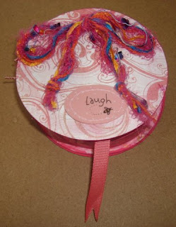
altered spoolie swap

this altered spoolie (the spool that holds the ribbon) was done for a swap for a myspace group, scrapbook rink in the lowcountry. the instructions were to take the cardboard spool that holds the ribbon and create a container with fold-out pieces that can be used to put pictures and/or journaling on.

the swap participants were to list 3 things below their names, and the partner was to look at that info and create a spoolie that the other person would/could like. my recipient liked "little girl" stuff and w/ granddaughters -- i could do that!

this is the top of the spoolie that is attached w/ fiber through the top and botton, passing just inside the ring of the spool. the bow is glued in place, but the ribbon has enough slack in it so that the top can open up and lay flat while viewing the inside.
the papers are glued together w/ the ribbon running down through between the layers. there were 8 circles w/ front and back surfaces for further altering or scrapbooking. the 8th circle was glued down to the bottom of the spoolie to anchor the pull-out pages to the bottom. the ribbon sticks out of the spoolie on the other end for easy pull-out viewing.

each surface has some decoration, but still has room for putting pictures, journaling, or other altering paraphernalia. since one side of the 8th circle is glued to the bottom, that leaves 15 cirlces (plus area on the inside and outside lid) to use for more creativity.

this project was made w/ the cardboard ribbon spool that was cut apart and covered w/ cardstock paper, glued bottom piece back to spool ring, and tied top to bottom to create the opening lid. various stickers, brads, silk flowers, cardboard signs, fibers, inks, and artwork were used for decorating. the main color was pink w/ accents in various shades of pinks/purples/yellows.

altered easter egg swap


this project of an altered easter egg swap was done for my myspace group, scrapbook rink in the lowcountry. the swap included the altered egg plus a list of items to include for the other person to use in altered projects or scrapbook projects. as an added bonus, the egg was to contain a creative surprise for the receiver.

the instructions were --
You will need a JUMBO plastic Easter Egg (they’re bigger than the basic plastic egg) and can be found at most dollar stores OR you can use a LEGGS Panty Hose Egg :]

You alter the egg and fill it with the following: (The egg must be decorated)
Theme: Easter/Spring/Pastels
10-Brads
10-Eyelets
10-Buttons
1-Yard Patterned Spring Ribbon
1-Yard Pastel Fiber
10-Primas
10-Rhinestones
1-Surprise (Please be creative with your surprise!)

my egg was a large green plastic easter egg that i used white w/ green polka dots tissue paper to cover. mod podge worked to easily attach the tissue paper to the plastic egg. then another coat of mod podge on top of the tissue paper to protect it. i used clear paint w/ silver glitter sparkles for 2 coats to add some more "finish" to the color. the last outer decoration was to glue some white rick rack w/ pink flower buds and green leaves around the center of the egg to hide the opening seam.

i received my swap egg from my partner, and that was a real treat -- both to see how the decor had been done and to see what all precious treasures were hidden inside! it was a lot of fun to get back to creating something and trading w/ someone else for fun. now i just wish i knew where all of my art supplies were that have been packed for moving to a new spot in the house (and of course, that spot it not yet ready for the supplies to be unpacked!).

Tuesday, March 24, 2009

loved

the "inspire me thursday" prompt this last week was "i am . . . " with instructions to fill in the blank w/ a one-word description. i was still busy working on the elvis picture, but i had time to think of words that describe who i am. after i thought of several words, i would realize that i was so much more than THIS word or THAT word.

after much time of consideration, i realized that i am all the things that i am because i was and am loved. this security and nurturing allowed me to develop into the person i am today and all the facets of my personality. whether good or bad -- that's who i am and i know that i am loved by those special people in my life. knowing that i have that safe harbor to return to any time makes it much easier to venture out into the world.

this piece measures 6" x 9" and is done with prang colored pencils on white 100 lb. strathmore bristol vellum. i spray my work with a working matte finish to protect the colored pencil from smearing until it is framed or otherwise protected.

Thursday, March 19, 2009

legendary - IF - 3/13

illustration friday's theme this week (3/13/09) was "legendary," and i was inspired to create this picture of someone i feel has been legendary in the music industry and pop culture in american society. this picture measures 15" x 22" and is done on stonehenge natural 90# paper w/ a prang #23 sepia colored pencil. it will be sprayed w/ a working fixative for protection until framing.

this was supposed to be just a small picture to encourage myself to get back into doing artwork, but my daughter said she would love to have a picture of elvis to put in their bedroom with the lyrics of "love me tender," which was the song played at her wedding. because of that stated wish, i felt compelled to make this picture big enough to be used for what she wants to use it for. this picture fulfills 2 things -- it gave me an inspirational project to work on and will hopefully provide a piece of art for my daughter's enjoyment.

Friday, October 24, 2008

MUMS the word

i've been playing around w/ the MACRO setting on my camera and snapped this picture of blooming mums at the pitt state homecoming parade. it's amazing the close-up focus that this setting allows, and it's also amazing what can actually be clearly noticed at this close level!

Monday, March 24, 2008

february DT2 ATC received!

dt2 ATC received - graphite dog by debbie byess

we arrived home from spring break to have this little jewel waiting in the mail for me -- an original graphite drawing by debbie byess. i've added it to my growing collection of original ATCs from the dt2 group.

thanks debbie! it's actually 2.5 x 3.5, but my scanner wanted to cut off the white part. i didn't have the patience to fight it any longer, so just posted it in this shape.

Monday, January 21, 2008

dec ATC received

dec ATC from DT2 trade came from vincent whitehead and is done in ballpoint pen. this original ATC is called "looking out". it is absolutely gorgeous. as i hold in my hand, i can tilt it side-to-side to try and see the pen marks or the shine on the ink, but no luck. it's just SO good it's hard to believe it's an orignal piece of art.

on top of getting the ATC, it arrived in this beautiful card that was also drawn by vincent, titled "oliver planter". it's like a double prize -- an ATC and a card that were both done by the artist.

honestly, i had to promise my husband to have a mat made that would show both the ATC and the card. that way, we can frame them both and put them up for display. he really likes this artwork, too.

Thursday, December 27, 2007

octopus killing shark

this piece really started out as a doodle while my students were working on an all-hour in-class writing assignment. i'm kind of stuck there monitoring them, but i can't interact w/ them in any way -- so i was doodling in my journal. the page was blue, so i thought of a water theme. i did the waves during class and then wasn't sure what to put under it.

originally i thought of a shark, and as i was looking up shark pictures on google, i found this story about an octopus caught killing the sharks in the tank. i found that extremely interesting from a philosophical standpoint -- the mean/tough bully of the ocean (which happens to have a very small brain compared to its size) is taken down by an intelligent creature with no backbone. h-m-m-m, sounds like some things in life that i know. those people who are bullies and try to force other people to bend to their will are not always going to win and will eventually be taken down by someone or something that has more intelligence and/or a better use of resources but is maybe not seen or thought of as being as "strong" as a shark.

this picture is done in a comp notebook w/ cheap acrylic paint for the background. the drawings part is done w/ a blue gel pen and the shark picture was cut out and glued in place. i was tired of working on the picture and didn't want to mess is up by drawing the shark wrong or something! no protective spray or covering was used on the page as gel pen doesn't smear unless it's wet. if the book gets that wet -- probably protective spray wouldn't save the picture anyway!

Sunday, November 18, 2007

jimmy and digging worms

this is a picture of jimmy, jerry's middle grandson, from our father's day fishing experience of 2006. jimmy was scooping worms up and dumping them out as fast the rest of us could find/dig/pickup the worms, so he wasn't mr. popular for that! other related drawings posted from that day are girls can fish, too and father's day -- 2006 -- fishing.

when jerry was in the hospital recently for knee replacement surgery, i needed something to do and only had this old picture to work from -- so this is what i drew. i had never done hatching in my artwork before, and it was amazingly stress-relieving to sit and do crosshatching to pass the time. plus, it gave me something else to focus on other than listening to jerry breathe and "jumping to attention" every time he wiggled or made a noise.

this picture was done w/ a black prang colored pencil on white 70# paper in a 9 x 12 sketch book. the finished picture was sprayed w/ matte sealant to prevent smudging.

Sunday, November 11, 2007

tiger lily - ATC for DT2

my latest serious art creation (or attempt at one!) is this tiger lily ATC for the DT2 exchange. i was going for an artistic impression of a realistic picture -- more adept than a typical coloring book picture, but not real enough looking that someone might mistake it for a photo. it almost seems to me to have a stained-glass quality, and i like that.

overall, i'm very happy with the creation and really sad to part w/ it. every time i work on a project like this, jerry always watches w/ interest. he never asks for a picture for himself, but then he makes comments later like "i wish you weren't getting rid of that one" or "that would look good on my desk".

i think if it were up to him, he would have all of my artwork framed and hanging all over the house. i'd feel like i lived in "the shrine of jill"! since much of it is artwork of our family, it would probably be ok, though.

this ATC was done on white Bristol Vellum paper with prismacolor colored pencils and sprayed w/ krylon workable fixatif to protect the colors from smearing. Being an ATC, this piece measures 2.5" x 3.5".

Saturday, November 10, 2007

copper "family" tip-in ab page

the double page spread was done in response to the color "copper" for a tip-in swap. i used the theme of family, as family is extremely important to me. the outer edges of the paper have been stamped w/ ink and then sprinkled w/ embossing powder, which melts when heated w/ a heat gun.

the tag on the upper right says "family" w/ the letters stamped on little copper "coins" and is sewn together in layers. the lower left is just a brown block of paper to be used as a mat for a family photo of the person who received my page in the swap.

on the right side, the quote says "the voice of parents is the voice of gods, for to their children they are heaven's lietenants" taken from shakespeare's work. on the lower right, i punched the year 2005 into a sheet of copper and glued on to the page.

when this person received the pages, then all he or she would have to do is glue on a picture of the family and have a completed and personal page. i was happy w/ it and intended to make one for my family, but just didn't get around to duplicating the page for myself.

emerald city pop-up ab page

this altered book page was done in a children's story book round robin and the technique this month was pop-ups. i couldn't imagine what more exciting to see pop in front of me as a child than the emerald city, so that's how i chose my page topic. well, that and i was born/raised in or near kansas -- so wizard of oz has always been a part of my life.

the background is just covered in green grass scrapbook paper. i had a calendar w/ beautiful pictures of poppies on one page, so i scanned that page in and printed out more poppies and cut out to glue on to the page. the yellow brick road is just made from yellow scrapbook paper and shaped to look like it is receding toward the city.

the pop-up part was the hardest, though, as i didn't have a pattern and just had to figure the folds out by myself. i knew i wanted it to be of the emerald city, but had to play around a little to figure out what size it could be and still fit in the book and still pop up when the pages opened. after a couple of tries, i had the right fit and a working design -- so i glued it in and was done.

sealant nightmares

i've had a few incidences lately where the sealant that i've been using has created a problem for my artwork. in fact, it has been such a problem that i have quit using it and purchased something else. i have used this several times before and on many projects and haven't had a problem that i could specifically trace to it, but now i have had a few very specific problems.

the first example, who is watching journal, was covered in full, vibrant colored pencil on top of acrylic paint. the silver/purple of the dragonflies and the various bright colors of the water's edge just disappeared when i sprayed the page w/ the krylon matte finish. once the spray hit the page, the vibrant colors just melted away. i thought they would return after the sealant dried -- but no such luck. i even tried to pencil them back in after the sealant had dried, but the colors will just not adhere and/or show up on these pages now. the dull colors are the best i can get to "stick" to the pages.

an even worse situation happened on pow-wow dancer, and i was so disappointed that i was almost sick. i had worked several hours on drawing, coloring, shading, blending, adding in last minute details and more. this was the first ATC i had ever made and i didn't want my trade partner to be disappointed in the ATC he received. i stayed up late to finish the picture so i could spray it w/ sealant before going to bed.

in the morning when i went out to check the ATC, i found that it looked like i had sprayed it w/ silver spray paint instead of sealant. i checked the bottle to see if i had grabbed the wrong can or something, but basically my beautiful (in my eyes, anyway!) ATC looked ruined, w/ "blobs" of silver covering the picture. the blobs of silver wouldn't scrape off w/o pulling off bits of the paper behind it, so i just decided to work on top of the problem.

i started coloring the picture again, and after about 5 hours or reworking the details and losing some other details -- i was able to save the piece. imagine my disappointment, though, to see what had happened to my picture and the time/work/effort i had put into it.

after these events, i was afraid to use the same stuff on my tiger lily picture that i had just finished. i really liked the picture and hated to invest the time/effort into a picture that would/could be ruined as soon as i sprayed it w/ sealant. i went to the art supply store and talked w/ the owner about what to do. she said she had had some of the same problems using the matte sealant, especially when she worked on a dark background.

she suggested that i use the krylon "workable fixatif" and that she had been very happy with her projects and successes with that product. it doesn't have the same finish as the matte sealant, but i didn't really want or need that finish. plus, it doesn't seem to have a problem w/ leaving residue or silver specks on my artwork -- and i really like that! what i need is protection from smearing and smudging, so it looks like i'm sold on "workable fixatif"!

so, if you're looking for something to protect your work, consider the "workable fixatif" rather than the sealant. from the name of the product, it's obvious that even though it has been sprayed, it's still a workable surface, so you can work/spray/work/spray, etc. sometimes i need that protection in one area of my work to continue on in other areas of my work w/o smudging one area to another.

any other ideas, suggestions, or stories of similar incidences and what you did to solve them would be welcomed here. after all, the comparison of products helps us all out in the end!

Saturday, October 27, 2007

raven's wedding dress shopping day

a special page from my comp book journal, as colored and decorated by my granddaughter, raven, and myself on the day we went to have mommy's wedding dress fitted. we needed something to keep "us" busy after we were done checking out the special toy room there for children. the book and colored pencils were just the ticket.

mommy was standing on the podium, looking like a fairytale princess as she was getting her dress all pinned up, while raven and i were frantically working on our journal page. amazingly, we got done at just about the right time, too. obviously i've had this page for a while and just forgot to get it photographed and posted, as the date on this page is nov 2005.

page background was painted w/ cheap acrylic paints and colored w/ prang colored pencils.

cafe del rio journal

this comp book journal page was done in honor of one of our favorite places to eat -- cafe del rio. since this restaurant opened in the mid-90s, we have spent many many hours of fun family enjoyment around the tables here -- dipping chips in salsa and cheese dip and sharing time together and talking about our lives and our events. everyone special in our lives has been to cafe del rio w/ us, too.

the decor is done as a mexican cantina, w/ buildings and designs painted on the walls. the colors are stereotypically bright, and that's what reminded me of cafe del rio when i opened up to this bright orange page and wondered what to do here. plus, a couple trips to "chips and cheese" with "the girls" (summer, raven and riahna) gave me plenty of inspiration and reminders.

the page background is painted w/ cheap acrylic paints, drawings in prang colored pencils, and writing w/ red gel pen. the page was then sprayed w/ matte sealant to prevent smudging.

plaza lights 2005 journal

recently i noticed that i had several journal pages that were "all done except for _______". a final detail or a few little things, but it has kept the page from being done. so i went through my comp book and marked the pages and made notes about what i needed to finish these up. on this page, i needed to have the picture printed and then write the journaling (which couldn't be done until the picture was placed!).

this is one of my favorite pictures of our trip to kansas city for the 2005 thanksgiving lighting of the country club plaza. it has taken forever to get this journal page done and posted b/c i couldn't seem to get all the things i needed together at the same time! this page is a part of my comp book journal where i just journal/create pages of events/feelings/designs for enjoyment. another journal page entry from this weekend can be seen at give thanks 2005.

the background was first painted w/ acrylic paint. then i drew an outline of the buildings on the plaza and used elmers glitter glue to dot on the outlines of the buildings to represent the christmas lights. it took forever for the glue dots to dry, and then even after drying -- the dots mashed flat in the book after is was closed for a while. black sharpie marker provided the black writing and black windows on the buildings.

the picture was taken by my son (scott) w/ my sony 5.1 megapixel cybershot camera and cropped to the size i needed to fit on the page. there is no protective covering on this page, as nothing requires it to keep from sticking together.

the fog pop-up ab page

this altered book page was done in a book with the theme of "cats". this was a techniques round robin, so we had to work with the owner's chosen theme while incorporating the assigned technique for that month. this particular month -- the theme was "pop-up pages".

i chose to use carl sandburg's poem "fog" to be able to incorporate pop-up pages that had buildings and fog on them. i painted the background pages black, to represent night in the city, and glued down a picture of a cat to represent all the stray and homeless and loose cats that run free in an urban environment. i also used a cat-toy mouse for the cat to have to show that cats do help control the environment from the diseases spread by too many rodents. the mouse was positioned and attached by the tail so that it hung outside of the pages when the book was closed.

for the silhouettes of the city and the fog in the background, i used stickers that looked like city skylines and stuck them to white sheets of vellum. i left about 1/4" of vellum below the stickers so that i could make folding tabs to glue to the book. i made 3 different layers of vellum/skylines so i could cut the outlines and edges to be different to add more volume and depth to the pop-up section.

next i had to figure out how to fold my pieces so that they would automatically stand up when the book was opened and automatically lay back down properly as the book was closed. this took more time and effort than i figured that it would, but overall it turned out well. i'm sure there are patterns for these things, but i'm more of a trial and error type person. of course, that means that i make errors and spend time fixing things!

Fog

THE fog comes
on little cat feet.

It sits looking
over harbor and city
on silent haunches
and then moves on.

who is watching journal

this comp book journal page started out as a page painted in a mixture of blues and greens. i thought it would look good to have a scene from the water's edge drawn there, w/ tall reeds and dragonflies and a dryad watching. the colors were bright, even on the grasses and dragonflies, but faded to almost invisible when sprayed.

the background was done w/ cheap acrylic paints and the drawing was done w/ prang colored pencils. when completed, the whole page was sprayed w/ krylon matte sealant, which dulled the colors of the pencils against the background. even w/ going back over the design in pencil again, i couldn't get the pencil colors to show well.

the idea behind this page is that a person should always be careful in life because many times others are watching and a person may never be sure when this situation could come back up to create a problem.

Saturday, October 13, 2007

ATC exchange - received from bonny

"Remember Summer" ATC received from bonny racca - my october 2007 ATC exchange partner through DT2.

this beautiful and original ATC was waiting at the post office for me today from my friend, bonny, from canada. it's done in watercolor and sepia ink on a creamy tan colored background.

it's just beautiful and i'm so happy to have been the recipient of such a card. getting a piece of original artwork in the mail is such a treat -- but this group of artists is just amazing!

Saturday, September 22, 2007

imagination tip-in


this tip-in page was done in response to "imagination" and i chose to focus on the works of leonardo di vinci. i found pictures of his drawings from his inventions and sketchbooks and cut/pasted them together on a page. then i printed the page out on paper that looked like aged vellum -- to make it look like paper from his journal.

i used a quote from albert einstien that says "imagination is more important than knowledge." that quote encourages me to believe that a person's knowledge is limited or finite while a person's imagination, if stimulated, is unlimited or infinite. if a person can imagine it, he or she can create it and/or make it happen.

i think that quote fits in perfect w/ di vinci, who had designed and documented things far ahead of his time, such as a helicopter or a robot or airplanes. he was intelligent, creative, and uncensored in his creations. i wonder how different the world would be if di vinci had not created the things that he had done and/or had not kept notes of the things that he imagined?

Thursday, September 13, 2007

the difference of macro

in the time that i've used digital cameras, i've been disappointed in that i couldn't take "close up" shots of my subjects. every time i tried it, the pictures turned out blurry and were not useful. rather than "waste" my pictures, i took pictures from further back and then spent time on the computer editing. i always ended up w/ good pictures, but not as good or as easy as i would've liked!

the amazing difference that macro photography provides is just shocking at first notice. this pictures was taken by my sony 10.1 megapixel cybershot at about 10 inches from this leaf. this was just a snapshot with no tripod used, but many nature or natural shots will not have the time for a tripod. live things don't stop long enough for tripod placement and adjustment!

the leaf is obviously blurry and basically not usable for a scientific drawing or closeup study of the leaf. if this were a picture of someone's face, where i wanted details to show, the blur would've ruined the picture.

by learning how to use the macro function on the camera, the same picture from the same distance taken as "macro" looks totally different. the blur is gone and now this picture is usable as a reference photo for a scientific illustration, a record of growth, or a part of your photography collection.

macro is definitely a function on your camera that you NEED to learn how to use and should use in your photography sessions. it makes a huge difference -- especially when you can compare the pictures side by side to see the amazing differences!

Saturday, September 01, 2007

MY first ATC created - pow-wow dancer

my first ATC created for the ATC exchange at drawingtogether2 yahoo group.

i was mainly enticed into the project because i saw the wonderful examples of artwork that these artists in this group are capable of -- so i wanted to get into the exchange so i could own a beautiful piece of artwork.

to do that, i had to create a piece of artwork to put into the exchange. i also signed up for the "prints exchange" where artists make prints of their own original works and send them to the other people on the list.

it turned out to be a great experience, but i was very intimidate by the quality of art that i had seen produced by these group members. i was afraid that whoever were to get my ATC would be disappointed in that my artwork wasn't as good as everyone else's artwork -- but it all worked out good.

this ATC was done on white Bristol Vellum paper with prismacolor colored pencils and sprayed w/ matte finish sealant to protect the colors from smearing. the picture was based on a photo that i had taken at a pow-wow near miami, ok a couple years ago.

ATC exchange - raccoon from rita

first ATC received, done in graphite by rita from the drawingtogether2 group at yahoo.

each month, the members have an ATC exchange where you can sign up to create an original ATC and exchange with another member of the group. you can also sign up to make prints of your original and exchange with other members of the group for prints of their original works of art.

this was the first ATC i have ever received and i just LOVE it. the detail and the quality of this work of art are just amazing overall. i can't wait to shop for a special frame for it and put it on display at home!

what color crayon would i be???

You Are a Red Crayon

Your world is colored with bright, vivid, wild colors.
You have a deep, complex personality - and you are always expressing something about yourself.
Bold and dominant, you are a natural leader. You have an energy that is intense... and sometimes overwhelming.
Your reaction to everything tends to be strong. You are the master of love-hate relationships.

Your color wheel opposite is green. Green people are way too mellow to understand what drives your energy.
if i had my choice, i think i would be a purple crayon -- as purple tends to be one of my favorite colors. but, red is not far from purple, and i guess my personality tends to be "red"! h-m-m-m, we'll see about that!

Friday, July 27, 2007

moon - IF

moon - IF - july 27, 2007

in drawing 1 class this summer, one of the first concepts we studied was negative space. this is a drawing that i did from a picture i had taken of the night sky and moon through the tree limbs. we were only to shade where the negative space was and to show depth by using darker and/or heavier lines.

drawing by studying negative space really made a difference in drawing. i would've never tried to draw this picture otherwise because all of "the stuff" was overwhelming to try and draw. by drawing what "was not" -- that made it much simpler.

this was done using 2H, HB, B, 2B, 4B, 6B, 8B, and 9B pencils on Canson heavy white drawing paper and sprayed w/ matte sealant to prevent smearing.